Creating a good slide deck is not hard, yet how many of us have lost countless hours of our lives sitting in long, boring, drawn out, should have been an email instead, meetings? Working remote due to the pandemic has exacerbated the meeting culture that permeates most businesses. Since they are a necessary evil of being in business, do your part to make sure that when you have to present content that you have a good slide deck. Here are my Top 10 Tips for creating one:
1. Know your slide deck program
You can’t create a good slide deck if you don’t know what the program is capable of doing. From templates to layouts, animations and transitions, graphics and video and customizing elements for your needs. Take pride in your work and learn your program inside and out.
2. Create an outline of the subject
Laying out all your slides based on your outline provides a framework that can then be filled in with the details. This is one way to avoid scope creep and stay on topic.
3. Create your deck a day or more in advance

Don’t wait until the last minute to create your deck. This is hard for so many people. You can’t do good work when rushing. Something will be forgotten, missed, overlooked or just be wrong and it only is discovered when an attendee points it out in front of everyone.
Take your time and start your presentation early. This allows you to reflect on and refine the content before you need to deliver it.
4. Stay on topic

Avoid scope creep and deliver the information you need. Nothing more, nothing less.
5. Use bullet points not paragraphs

This is definitely a case for ‘less is more’. Do not cram so much content on a single slide that the font is so small nobody can read it.
I can’t tell you how many presentations I’ve sat in where I couldn’t read the slide from the back of the room because they put 5 slides worth of content on one slide and talked for 30 minutes on that one slide.
A good slide deck is a visual aid to the information you are providing. It is not a novel to be read. Highlight the key points you want to make and fill in the rest during the presentation.
A rule of thumb is that you should spend no more than 1 minute per slide.
6. Don’t use gimmicky, fancy or script fonts
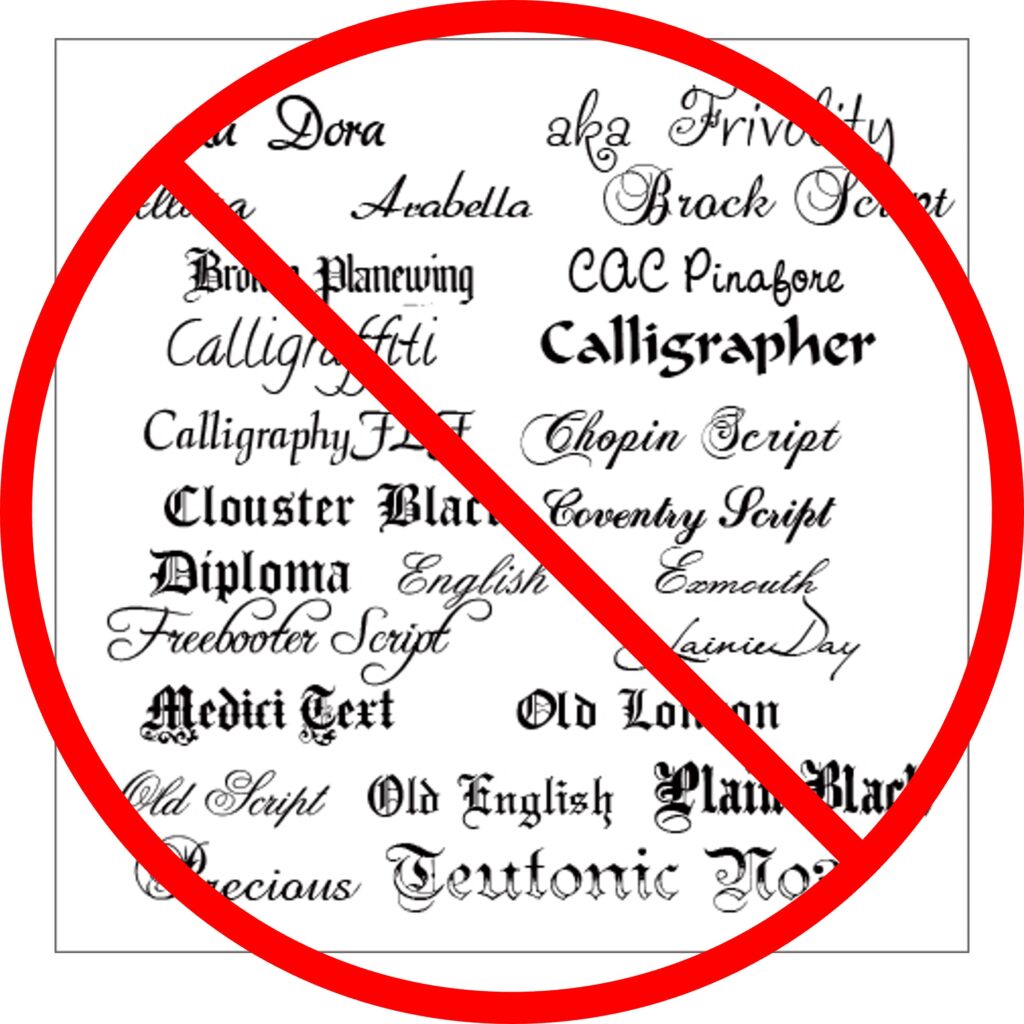
They are too hard to read.
Stick with basic sans-serif fonts that are crisp, clean and easy to look at from a distance.
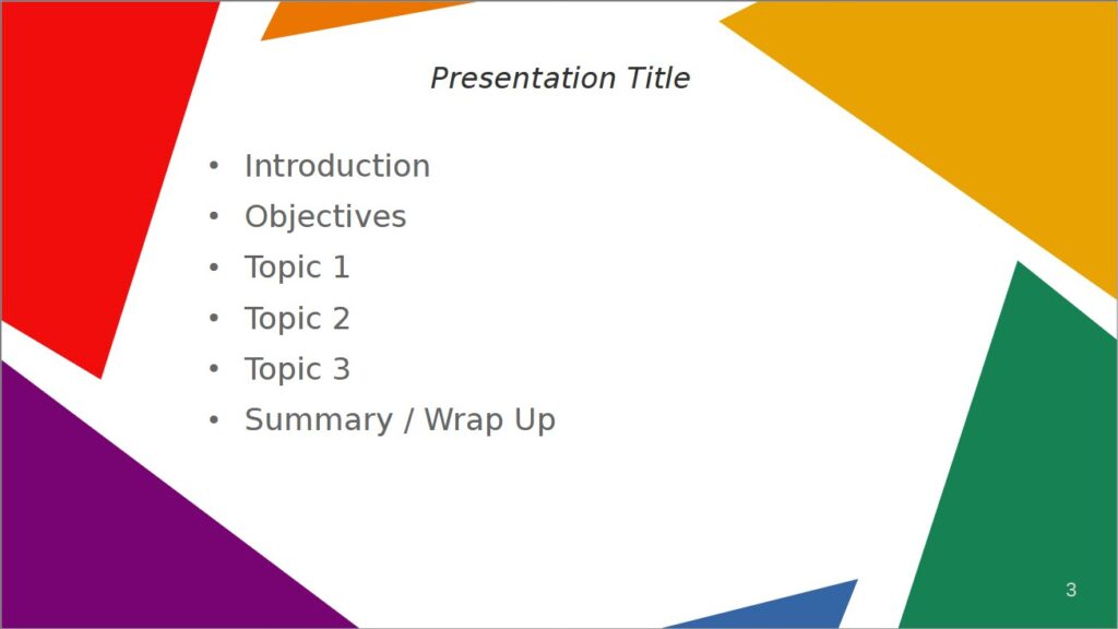
7. Use different layouts for content
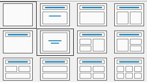
Most presenters only use two slide layouts…the Title layout for their first slide and the Title + Content box layout for all the rest.
I don’t know if they are afraid to experiment or just don’t know the program (see Tip #1) considering most templates come with at least 7-8 layouts to pick from if not more. Make sure that you use the appropriate one for the content being presented.
Don’t see a layout you like or works for your needs? You can customize or create your own, it’s really not hard.
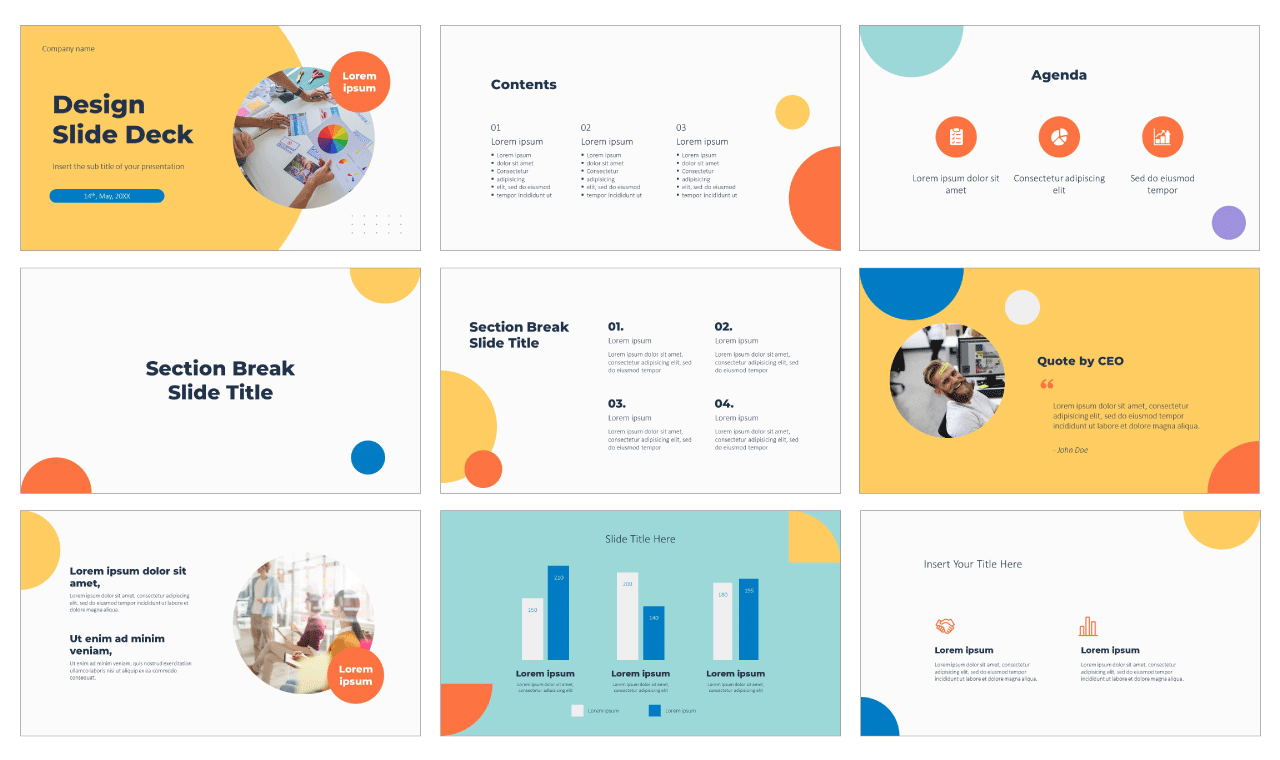
8. Use Pictures, Charts, Graphs & Infographics
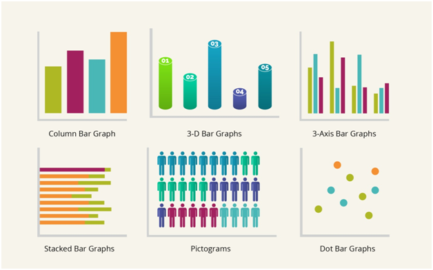
The old adage “a picture is worth a thousand words” could not be truer when it comes to slide decks. Use pictures, graphs, charts, emojis, etc.
Whatever gets your point across without needing paragraphs of text to explain. You as a presenter can fill in the necessary details.
9. Embed Videos when possible
This is to make sure that you can still play the video during your meeting. The extra bandwidth required to stream directly from the Internet may not be available or can interfere with the bandwidth of your online meeting causing audio and visual issues. Don’t risk it.
10. Use Animations & Transitions
Animations are added to elements in a slide like text and pictures. There are dozens of entrances, emphasis and exits to choose from as well as custom motion paths.
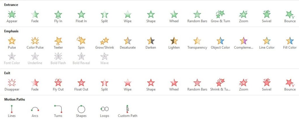
Transitions happen when changing slides and can signal the shift between sections or topics in a presentation.
Not only do these break up the monotony of text on screen, but they also keep your audience engaged and focused on what you are talking about at that moment. If all the text appears on-screen at once, they tune you out while they try to read everything versus a single bullet, completely missing any context you are providing.
A couple of things to consider:
- Only use one or two different animations per slide. It’s ok to use a wide variety of different animations across different slides (and recommended), but keep it consistent on a single slide.
- Not all items on a slide necessarily need animation. This is a judgement call based on the content being presented. Sometimes, I will have the text animated while the image, chart or graph is not. Other times, I may have multiple over-lapping images that appear in tandem with a bullet point. Experiment and change things up from time to time.
- Use different transitions for each slide or sections of your deck to keep it fresh. Sometimes I use a transition on all slides, other times, just between sections.
Wrap-Up
It’s not hard to create a good slide deck if you follow these tips. Your audience will appreciate it and be much more receptive to the message you are delivering. Now that you have a good slide deck you need to give a good presentation. Stay tuned for my article next month on that subject.
BONUS: Bad Presentation Bingo
To help you identify bad presentation habits, I am including a bad presentation bingo card for you to use during presentations. Use it to help you avoid the pitfalls so many fall into. This is a fun way to gather feedback but also keep yourself mildly entertained when you’re watching a bad presentation.
Last Updated on August 16, 2022