
PDF-Xchange form features allow you to create fully interactive electronic forms for practically any use you can think of.
In March I wrote about the overall capabilities and features of PDF-XChange Editor and last month I talked about Moving from Paper to Digital Forms. You can read those articles by clicking their links. This month I want to take a deeper dive into the electronic forms capabilities this product has if you are ready to start digitizing your paper forms.
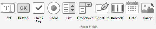
Field Types
There are ten field types available to create your electronic form. Each has various options you can specify.
Almost all options give you the choice of:
- Font
- Font Size
- Font Color
- Background / fill color
- Border color
- Border style
- Border width
- Required or optional
- Define the tooltip
Before I show you how to configure those, let’s take a more detailed look at each field type and some of their abilities.
Text
The text field is one of the most common field types used on an electronic form. It is very versatile as you can specify a great number of options for this field. In addition to the options listed above, you can also specify:
- How many characters long
- Single line or multi-line
- Letters only, Numbers only, or both
This allows for creation of specific fields for time or percentages to name a few.
Button
A button field is usually used to perform an action such as Save, Print or Submit. When creating a button you need to specify the command that the button will execute when pressed.
Check Box
Check boxes are another very common field on forms. They are used to make interactive checklists and you can have dozens or hundreds of these depending on the form being created.
Radio button
Radio buttons are used when a choice is presented an you can only pick one of the options. This is very commonly used in True/False or Yes/No scenarios. It is possible to create a radio button with more than two choices, however only one can still be selected.
List
List fields are useful when you want to present a selection of choices. More than one can be selected by holding the CTRL key when selecting.
Dropdown
Dropdowns are useful for presenting a list of pre-defined options without taking up a bunch of space to display them all on your form. Only one option can be selected from a dropdown list.
Signature
Signature fields can be used in a variety of ways. You can simply input them to indicate a signature or initials are needed or they can be tied to digital signatures and security certificates.
Barcode
The barcode field offers a selection of three different types of barcode to choose from:
- Barcode
- QR Code
- Data Matrix code
Each of these can be encoded with information that can be read by a barcode reader. Most smartphones these days have built-in barcode readers and the most common type is a QR Code. You can encode an email address, a website, a file download and more.
Date Picker
This field should be pretty self-explanatory. It allows for the selection of a date on the calendar.
Image
The image field allows you to upload a picture with the form.
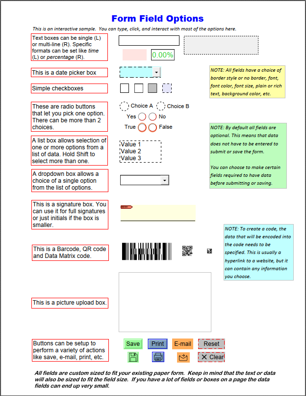
Sample Form
Here is a sample form that shows each field type with several examples of each and some of the options I just mentioned. A interactive copy is downloadable, just click the button.
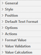
Field Properties
Each field has various properties associated to it that you can customize to specify the behavior of that field. Since the Text Field has the most options I will go in to those in more detail. Most other fields share the first 5-7 property categories as the text fields so it should give you a good overview of the capabilities.
The properties of a text field are organized as follows:
General
| Property | Options | Default Value | Notes |
|---|---|---|---|
| Read Only | Yes or no | No | |
| Locked | Yes or no | No | |
| Field Name | Must be unique | Auto-named | These are important to make sure your data points can be tracked. Duplicate field names will cause issues so make sure to have a good naming standard if you want to change the form defaults. |
| Tooltip | <Not Set> | Allows you to put in a helpful hint that pops up when hovering over the field. | |
| Mapping Name | <Not Set> | ||
| Orientation | 0, 90, 180, 270 | 0 | |
| Visibility | Visible Hidden Visible but not printed Hidden but printed | Visible | |
| Required | Yes or no | No | If you set a field as required, it cannot be saved or submitted until the field has the requested data in it. |
| Exportable | Yes or no | Yes | |
| Layer | None |
Style
| Property | Options | Default Value | Notes |
|---|---|---|---|
| Fill Color | 16,777,216 colors | None | You can specify any color of the RGB color spectrum. |
| Stroke Color (Border) | 16,777,216 colors | RGB: 0,0,0 (Black) | You can specify any color of the RGB color spectrum. |
| Border Style | Solid | ||
| Border Width | 1pt |
Position
This specifies the point on the form where the field is placed. I have never needed to change or mess with these settings although it is possible to change the values to adjust the size and position on the form.
| Property | Options | Default Value | Notes |
|---|---|---|---|
| Left | varies | Based on where the field is placed | |
| Top | varies | Based on where the field is placed | |
| Width | 150 pt | How wide the field is | |
| Height | 22 pt | How tall the field is |
Default Text Format
| Property | Options | Default Value | Notes |
|---|---|---|---|
| Font | Any installed font | Arial | Can choose any font installed on your pc. |
| Font Size | Auto, 8, 9, 10, 11, 12, 14, 16, 18, 20, 22, 24, 26, 28, 36, 48, 72 | Auto | Auto resizes the text to fit the field size, getting smaller the more text that is typed. |
| Text Color | 16,777,216 colors | RGB: 0,0,0 (Black) | You can specify any color of the RGB color spectrum. |
Options
| Property | Options | Default Value | Notes |
|---|---|---|---|
| Alignment | Left, Center or Right | Left | |
| Default Value | <Not Set> | ||
| File Select | Yes or no | No | Can only be used is Check Spelling is set to No and Scroll is set to Yes. |
| Password | Yes or no | No | Can only be used is Check Spelling is set to No. |
| Check Spelling | Yes or no | Yes | |
| Multi Line | Yes or no | No | |
| Scroll | Yes or no | Yes | |
| Allow Rich Text | Yes or no | No | |
| Comb | Yes or no | No | Can only be used is Check Spelling and Scroll are set to No. |
| Character Limit | <No Limit> | Used to restrict a field to a set number of characters. Think zip codes, phone numbers, etc. |
Actions
| Property | Options | Default Value |
|---|---|---|
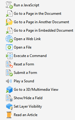
| Mouse Down | See picture | <Empty> |
| Mouse Up | See picture | <Empty> |
| Mouse Enter | See picture | <Empty> |
| Mouse Leave | See picture | <Empty> |
| On Focus | See picture | <Empty> |
| On Blur | See picture | <Empty> |
Format Value
| Property | Options | Default Value | Notes |
|---|---|---|---|
| Category | None Number Percentage Date Time Special Custom Action | <Empty> |
Value Validation
| Property | Options | Default Value | Notes |
|---|---|---|---|
| Validation | None Value in Range Custom Action | <Empty> | Value in Range only available for fields formatted as Number |
Value Calculation
| Property | Options | Default Value | Notes |
|---|---|---|---|
| Calculation | None Sum (+) Product (*) Average Minimum Maximum Simplified Notation Custom Action | <Empty> |
Selection Change (List field only)
The List field has one additional property field that is customizable.
| Property | Options | Default Value | Notes |
|---|---|---|---|
| Selection Change | <Empty> | Allows you to Edit the JavaScript |
Signed (Signature field only)
The Signature field also has one additional property field available.
| Property | Options | Default Value | Notes |
|---|---|---|---|
| When Signed | Do Nothing Mark as Read Only Custom Action | Do Nothing |
Summary
While it may seem complicated to create an electronic form, it really is not. Once you understand what the fields are, and how they can be configured, you can do all sorts of great automation to collect and collate data from electronic forms.
If you have or decide to purchase a copy of PDF-Xchange Editor, you can edit the downloadable sample form and experiment with the properties of each field for yourself.
Let me know your experience with PDF forms in the comments below.
Last Updated on March 28, 2023