Digital forms have been used in some form or another for the past 30 years. Unfortunately, most companies that try to move from paper forms to digital forms do not have a very good experience.
Why, you ask?
Because the paper form was purpose built for paper. With as much information that could be crammed on a single sheet of paper, so it was all in one place. That works great if you are using a clipboard and pen. Not so much if you are using your finger on a touchscreen.
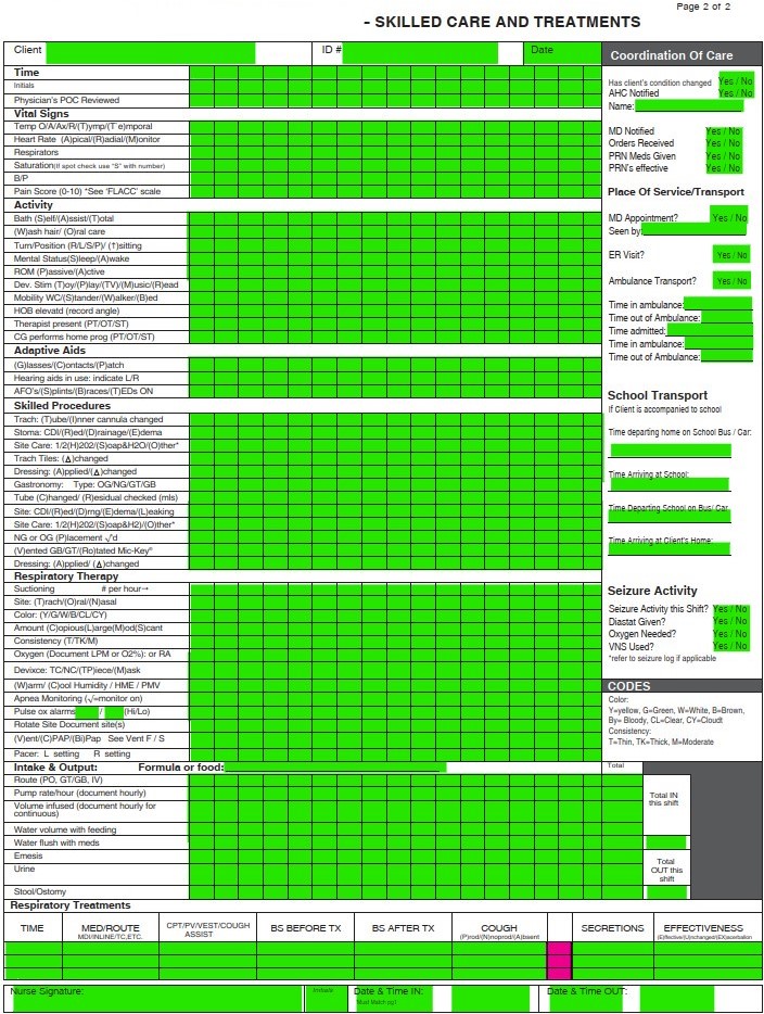
Paper Form Example
I was once asked about turning a paper form into a digital copy. They wanted to use it on an iPad with their fingers. Instead of writing the codes in the boxes like they did on paper using a clipboard, they wanted the onscreen keyboard to pop-up every time they touched a field.
The Paper Form
This is that form. The green boxes are the fields that needed to be filled out. The pink boxes were blank fields that did not need to be interactive.


The Issues
The problem with this was that these boxes were tiny even for a paper form using a pen. How do you think a finger worked? They were too large to accurately touch into the necessary fields to edit them, often times touching the wrong field. The onscreen keyboard made it even more challenging because it would pop up and block most of the screen. In order to be able to read and input the codes, they had to zoom in and scroll around the form to find what they wanted.
On page 2, there were other design elements that required YES or NO be circled. Again, not easy to do with your finger on something this small and usually resulted in the area not being able to be read at all.
The users got lost frequently and their frustration was evident. It was taking twice as long or more to fill out. Many users preferred the manual paper form over messing with this as a digital form.
The Solution
In the end the form needed to be redesigned from scratch using a survey approach with each section being its own page in the survey. There was no zooming required.
- The font and selections were readable, and choices made available for easy touch interaction.
- The onscreen keyboard only popped up for text fields were a narrative had to be typed. The rest of the boxes had drop down sections to touch what they needed.
- Once the current section was complete, they clicked a NEXT button to take them to the next area.
- A menu button was added to allow them to quickly bring up and navigate to a specific section of the form.
- A save button allowed the data to be saved to a cloud location.
- Those YES or NO selections became radio button selections.
Using is believing
This was my recommendation from the beginning, but they didn’t want that. They had me recreate the paper form in digital format.
It was no easy feat and took me a couple days to complete. Although I was being paid to do the work, it irked me to no end knowing it was throwaway work that they were not going to be happy with.
It wasn’t until they started using it and seeing all the problems I warned them about that they begrudgingly acknowledged the issues and accepted my recommendations. It cost them an extra week of time and exceeded their budget for the project. Fortunately, I knew this would happen and had already started working on the rough outline of a survey style form so I had a prototype ready for testing in short order.
The end-result could not have been clearer and more profound for those tasked with filling this out. It wasn’t long before they were clamoring to have the finished product and could ditch the paper form for good.
Lesson Learned: A screen is not the same as paper
With digital forms, the size of a piece of paper is irrelevant. What matters is the data you are trying to capture and store. Trying to force people to interact with a digital version of a physical form is guaranteed to fail in most cases. People won’t use it, preferring to continue using the paper version instead as I have witnessed numerous times.
There is nothing more frustrating than trying to use a scan of a paper form with its tiny print and boxes that you can’t easily use your finger or a stylus with. If you have to zoom in constantly and scroll around to find the area you need to fill out, that is not intuitive, easy or a good experience. It also causes errors and inconsistency with the data because of unintentional taps on the screen that adds, changes, or deletes data.
Adapt the Experience
If you want to change that, you have to adapt the information gathering process to the medium you are gathering it on. When moving to touchscreen devices like an iPad, iPad Mini, Surface Pro, etc., the capabilities the form factor offers make it easy to gather information easily…only if you can read and interact with the form easily.
Take the time to redesign the process to take advantage of a digital forms’ true capabilities. If you do that you will be much happier with the result and those that have to interact and use the form will enjoy using it.
Change is Difficult for Most
This is one of the fundamental issues in human behavior. We get comfortable with things being or done a certain way. We resist change almost instinctively.
For 30+ years now we have interacted with digital versions of paper documents on screens before printing it out on paper. Naturally a paper form turned into a digital form should look and work the same way, right?
That is how most people think. It is not until they are forced to look at the situation from a different perspective that they may be able to change. Some can quickly adapt, while others will complain until they die.
I find how you approach individuals can make a world of difference in them learning how to accept a change. Too many businesses make changes without explaining the change to their workforce. Understanding the worker perspective allows me to tailor my message to them to ensure they are hearing what they need to hear to accept the change.
Often times, it is as simple as educating them on what the change is and how it will make their work easier, faster, more efficient, etc. compared to what they do now.
What makes Digital Forms so much better?
So here is how changing to digital forms will make life (work) better for you:
- Data collection – The ability to collect and collate data in a central repository regardless of where it was collected.
- Reporting – Being able to generate reports and view the data in different ways that is not possible with paper forms.
- Reduced errors – Setting the properties on form fields to only collect the type of data needed in that block. For example, numbers only or letters only, a specific number of characters, etc.
- Improved consistency – Setting requirements on fields that have to be filled out before submission ensures you are gathering what you need.
- Security – having access to automatically logged data about who did what and when that can be reviewed and acted upon if necessary. No more paper that can disappear anonymously.
- Space – Think of how much space can be saved by not needing filing cabinets or rooms dedicated to paper files?
Digital forms can be used to collect almost anything
Any type of information you want to collect, store, report on, etc. I have seen digital forms for the following:
- Annual Reviews
- Car Rental Surveys
- Change Requests
- Course Feedback
- Hotel Surveys
- Inspection Forms
- Interactive Workbooks
- Job Applications
- Safety Forms
- Sport statistics
- Performance Improvement
- Product Surveys
- Roleplaying Game Character Sheets
Any type of document that you need to gather information for is a perfect candidate for a digital form.
Digital Form Tools
There are a number of applications on the market today that make creating and using digital forms easy with the ability to create contextual data collection based on answers to previous questions. Here are some of the more popular ones:
- PDF Editors (Adobe Acrobat, PDF-XChange, Foxit PDF Editor, etc.)
- Microsoft Forms
- Google Forms
- Typeform
- Jotform
- FastField Forms
- Survey Monkey
PDF Editors
PDF editors are good at turning paper forms into digital forms. It is usually the first step companies take when deciding to go digital.
PDF Editors can also be used to create automated functions that are activated by commands linked to a button. Actions like Save, Print or Clear Form for example. They can be configured to collect and collate the data in a database so that you can search for information and generate reports, just like web-based tools. Digital forms can also have built in calculations to reduce manual calculation of information and potential errors.
As I discussed at the beginning turning a paper form digital usually results in a bad experience, but it doesn’t have to.
Use Version 1.0 to gather feedback
When turning a paper form into a digital version, make sure it is only a steppingstone to get experience with the data collection and reporting aspects of digital forms, it can be useful. Gather feedback from those that use the form on what is working and what isn’t. This is crucial to understanding how the form is used and how to improve the data collection process. Use the feedback to create a better experience for version 2.0. Adapt the information collection to the device being used to collect it.
Web-based Tools
Online tools like Microsoft Forms and SurveyMonkey let you create interactive forms that use a web browser. They automatically collect and collate the data for analysis and report generation. Usually, tools like this have limited customization options. You are stuck with the form layout and functions the tool provides.
How much time can digital forms save?
Digital forms can save innumerable amounts of time doing manual data entry and report generation. It also cuts down on the potential for errors.
Real-life case scenario
The Safety department in a company I used to work for had lots of paper forms for safety and equipment inspections that were required by law. They had binders and filing cabinets full of this paper that they had to keep and produce when regulators or inspectors came by to review the information. Often times the forms were incomplete or missing. It took a lot of time to manually locate and collate the data from these paper forms. Needless to say, it was just as time consuming for the inspectors as it was for the business.
The Safety manager at one smaller location took it upon himself to turn his paper forms into digital forms. Using a combination of a form software and SharePoint he created forms that could be filled out on an iPad Mini tablet and submitted to a database. This database could then generate automated reports. The workers could also access all their technical and safety manuals digitally on the iPads as well.
Night & Day Difference
The amount of time saved was impressive. I don’t recall the exact numbers but, instead of a technician having to go retrieve a physical manual or specification, he could bring it up on his tablet in less than 30 seconds, no matter where he was in the facility.
Inspections of fire extinguishers, cranes and other safety equipment were now tracked in real-time with alerts being sent to management if a report was not submitted on-time.
Equipment out of service was now fixed faster because of those same real-time alerts notifying managers same day instead of waiting 3-7 days for a paper form to make its way to them.
Inspection forms now contained the information required due to the ability to prevent submission until all required fields were filled out.
Those same forms that on paper would often be missing the name of the person that completed it, now had all information automatically logged based on the userid of the person logged into the device. Those logins were based on facial recognition.
Visiting regulators and safety inspectors no longer had to spend days combing through binders and filing cabinets of paper forms. They received regular status reports via email containing the data and trends before they even showed up. This provided them the ability to review the information ahead of the visit, dramatically reducing the time they spent on-site.
The initiative was so successful, that the safety manager was tasked with implementing this digitization process to all other locations like his.
How difficult is it to do?
The amount of effort is going to depend on several factors:
- The size of the form or document you want to make a digital form.
- Design changes to be functional on a touch-screen device
- The overall number of paper documents you need to turn into electronic forms.
I have created some digital forms in as little as 30 minutes and others have taken me numerous hours over several days to complete. Many people look at it based on the number of pages, but I count the number of form fields (data points) that have to be created. A one-page form with 50 data points is a far cry from a single page with a table containing 400-500 data points.


For Forms / Documents
I use PDF-XChange Editor Plus to create digital forms and workbooks that I use in my online-courses. It is a 3-step process to create the digital form:
- Create a document in Microsoft Word. I add tables and checkboxes where I plan to overlay the form fields.
- Save As PDF.
- Use PDF-XChange to add (overlay) the form fields that make it a fillable form document.
For Surveys
For surveys I use Microsoft Forms. I find it the right amount of flexibility and function to gather information and generate reports without being overly complicated. I will be writing a review of Microsoft Forms at a later date.
Bottom Line
Digital forms save time and money. If you are still using paper forms to gather information, it is time to ditch the paper and move into the 21st century.
Next month I will go over the form features of PDF-XChange Editor Plus so that you can see all the possibilities of digital forms. You can read my review of the software at the link above.
Last Updated on March 28, 2023


